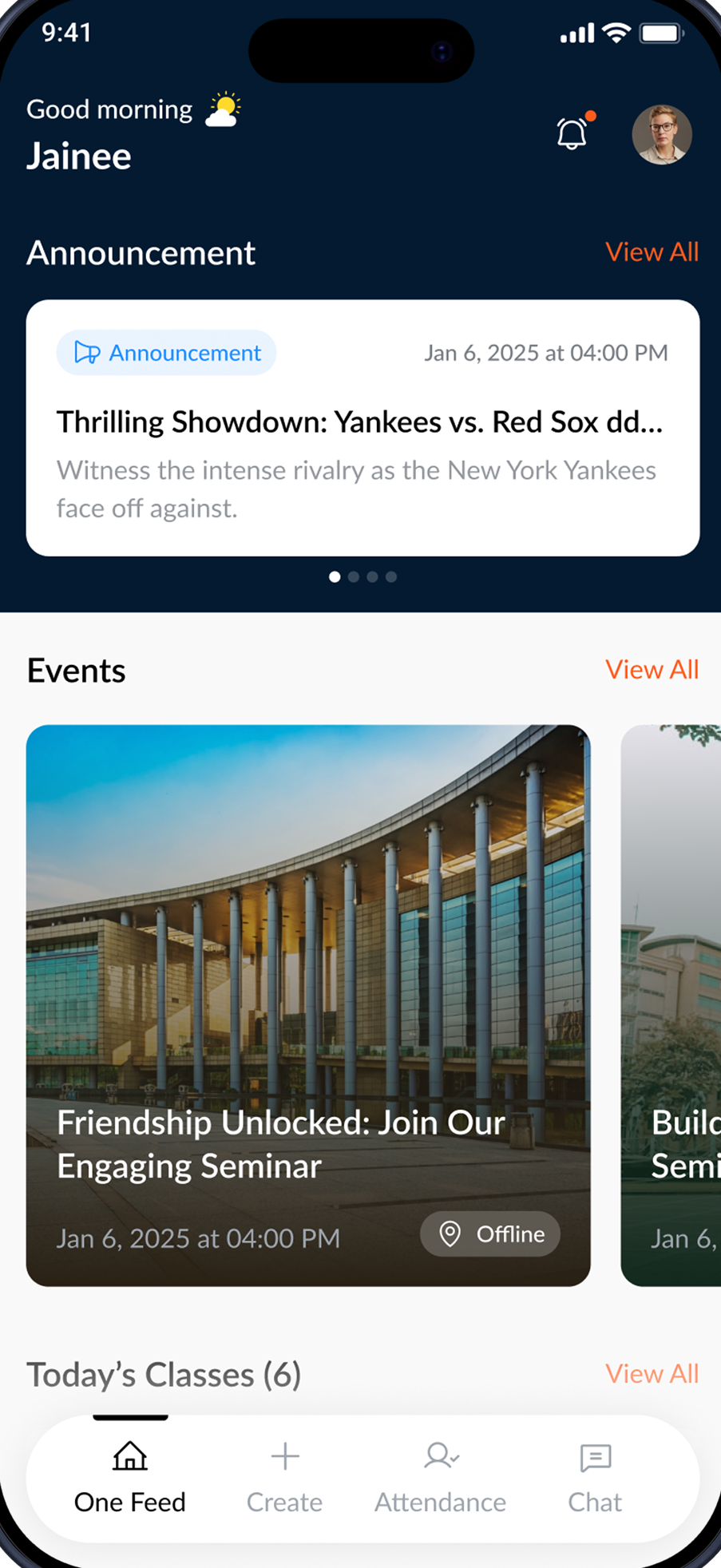
EdTech Mobile-first Adult learners · California Live

Bridge — one app,
made whole.

An app adult students already opened every day — rebuilt from a broken, fragmented experience into one calm, accessible whole.

Winner Best App Design DesignRush · March 2025
Role
Product Designer — research → ship
Industry
EdTech · accessibility-led adult education
Status
Live in the field with real learners
Year
2024 — 2025, ongoing iteration
In short

A daily learning app for adult students, rebuilt whole — and adopted across the state.

  • Took one fractured app and re-spined it around a learner's real day.
  • One calm feed, one-tap attendance, plain-language UI for low digital literacy.
  • Shipped across 76 campuses — and named Best App Design, 2025.
The needle +18% increase in learner retention after the redesign
(01) — Context

Learning wasn't the problem

The system was.

Bridge serves a US charter school for adults without a high-school diploma — many immigrants and refugees, aged 20–60, balancing class with work, family and a new country.

It was meant to be one app for everything. Instead, flows dead-ended and screens contradicted each other — and for learners facing language and literacy barriers, that quiet breakage made simple tasks overwhelming.

76
Campuses statewide on one shared platform
15K+
Adult learners relying on it day to day
200+
Staff coordinating classes and support
(02) — The problem

One app. Fractured.

Not a dozen tools — one product breaking under its own seams.

Drag the handle — or just scroll — to watch the same screen go from broken to whole.

Before After
Bridge — after the redesign
Bridge — before the redesign
FIG 2.1 Drag to compare — the same screen, before → after.
What broke — in four words
Dead-ends. Journeys stopped with no next step. Contradiction. Every screen had to be re-learned. Uncertainty. Status you couldn't trust. Language. Dense, English-only copy in the way.
(03) — Key insight

Built for features, not people

The app wasn't built around how people actually learn.

Every fix so far had added another screen — and more surface only deepened the fracture. The opportunity wasn't to add, but to remove friction and reconnect the pieces learners already had.

The old briefAdd more features
The real oneMake it whole
(04) — The solution

Get the highlights

One coherent app, built around the rhythm of a learner's day.

One Feed

The whole day up front — announcements, events and today's classes in one calm scroll.

Events

Every event with clear time, place and detail — no dead ends.

Attendance

Mark attendance in one tap. A clear history shows what's done and what's pending.

Campuses

All 76 campuses, one tap away — calm, searchable, never overwhelming.

Directory

Reach any student or staff member in seconds — the network, made human.

The job wasn't to add — it was to remove everything between a learner and what they came to do.
The principle behind every Bridge decision
(05) — Visual system

Familiar by the second screen

One consistent UI system replaced the contradictions — so every screen teaches the next.

Palette

Action
Navy
Sky
Submitted
Surface

Type hierarchy

Screen title28 / -2%
Section20 / -1%
Body — generous, legible17 / 0
LABEL / META11 / +10%

Components

All (7) Pending (2)
Jan 4, 2025✓ Submitted

Principles

Clear typography hierarchy
Consistent, reusable components
Minimal, distraction-free layouts
(06) — Impact

What it moved

+18%
Increase in learner retention
A unified, accessible experience lifted engagement across the platform — students stayed because the app finally stayed out of their way.
Lower cognitive load

One coherent home replaced contradictory screens — orienting takes seconds, not minutes.

More accessible

Plain language and a calm, consistent layout opened the product to lower-literacy learners.

Less admin

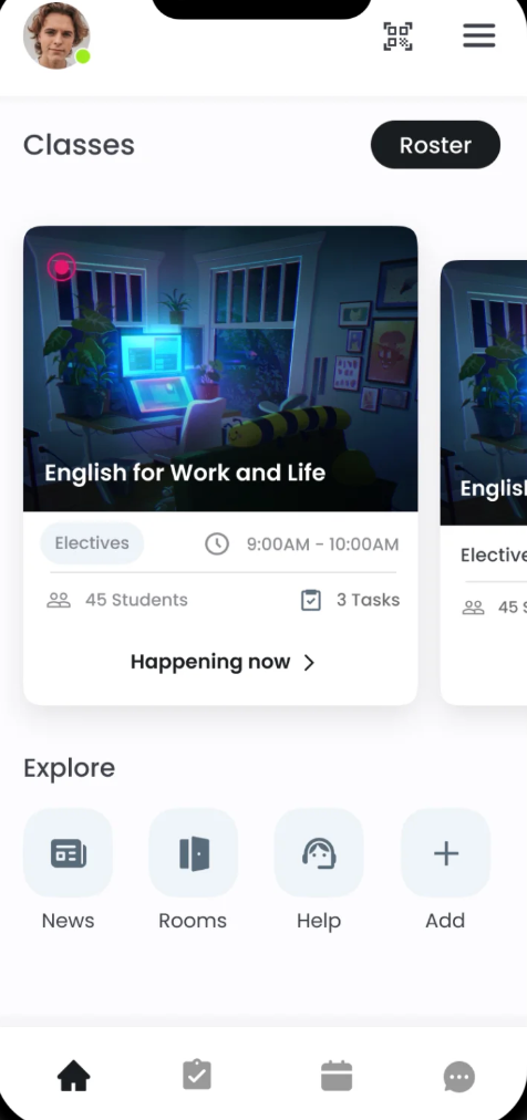
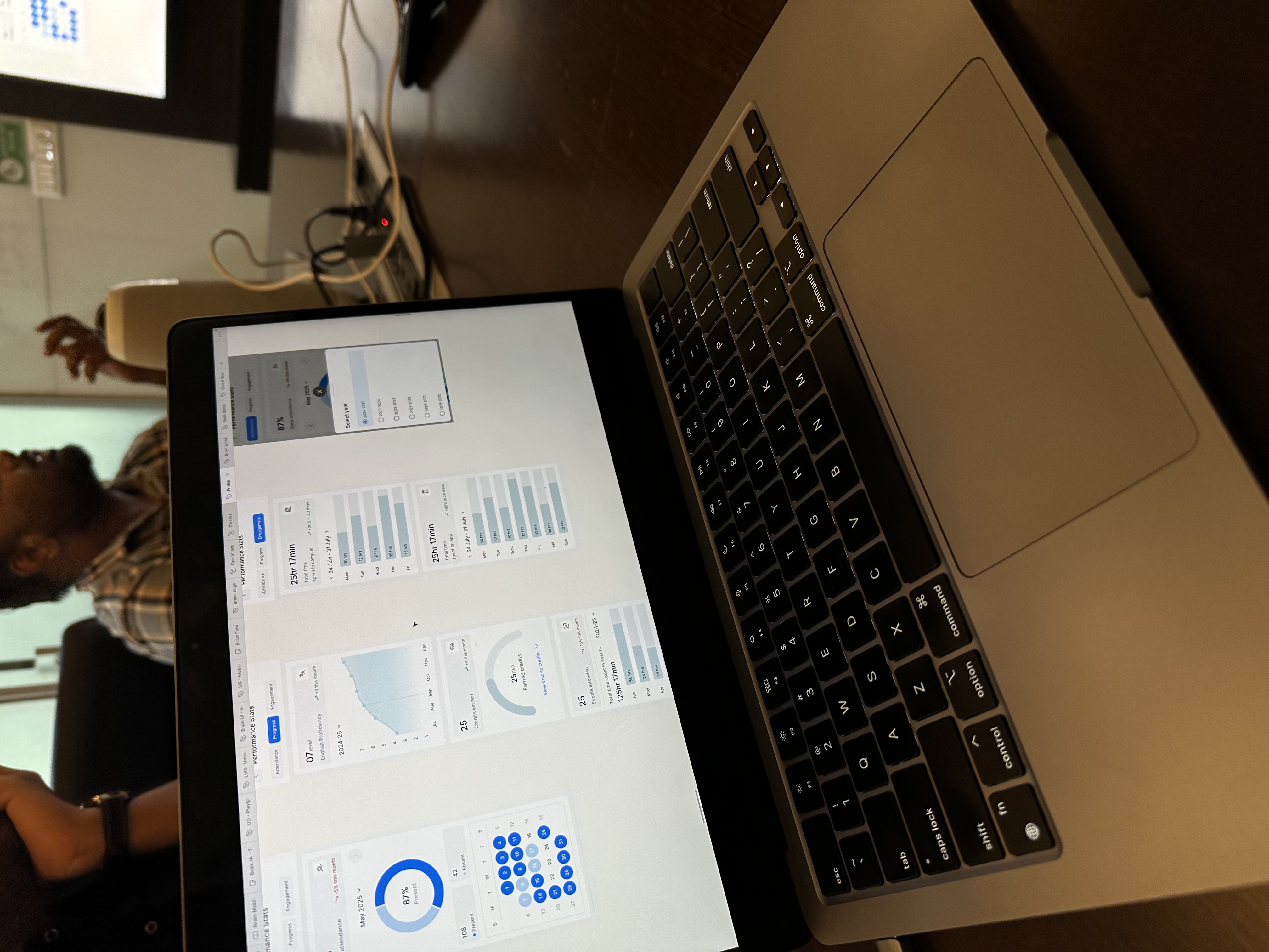
One-tap attendance and a clear history freed educators from manual roll-call.

(07) — Behind the scenes

Built in the room

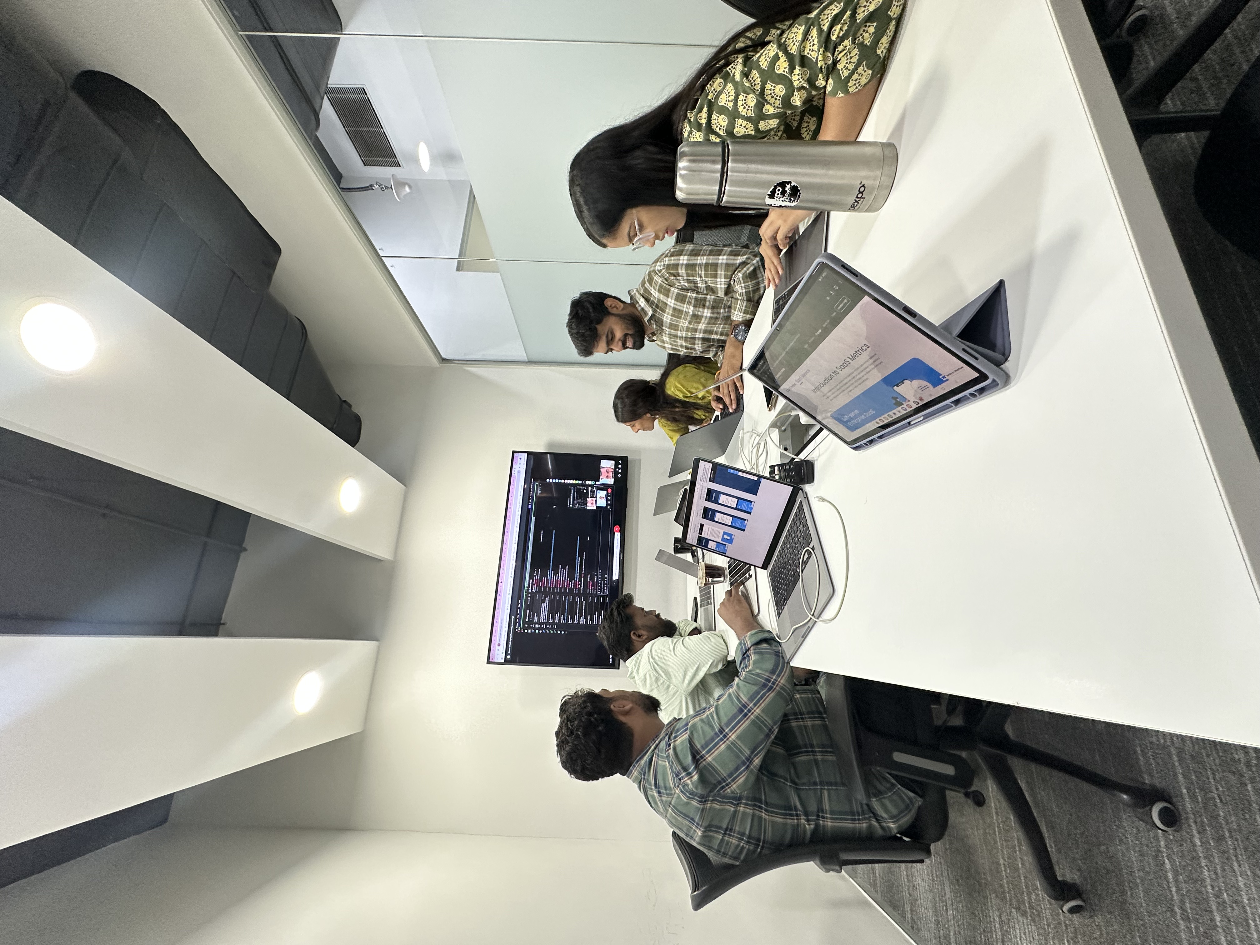
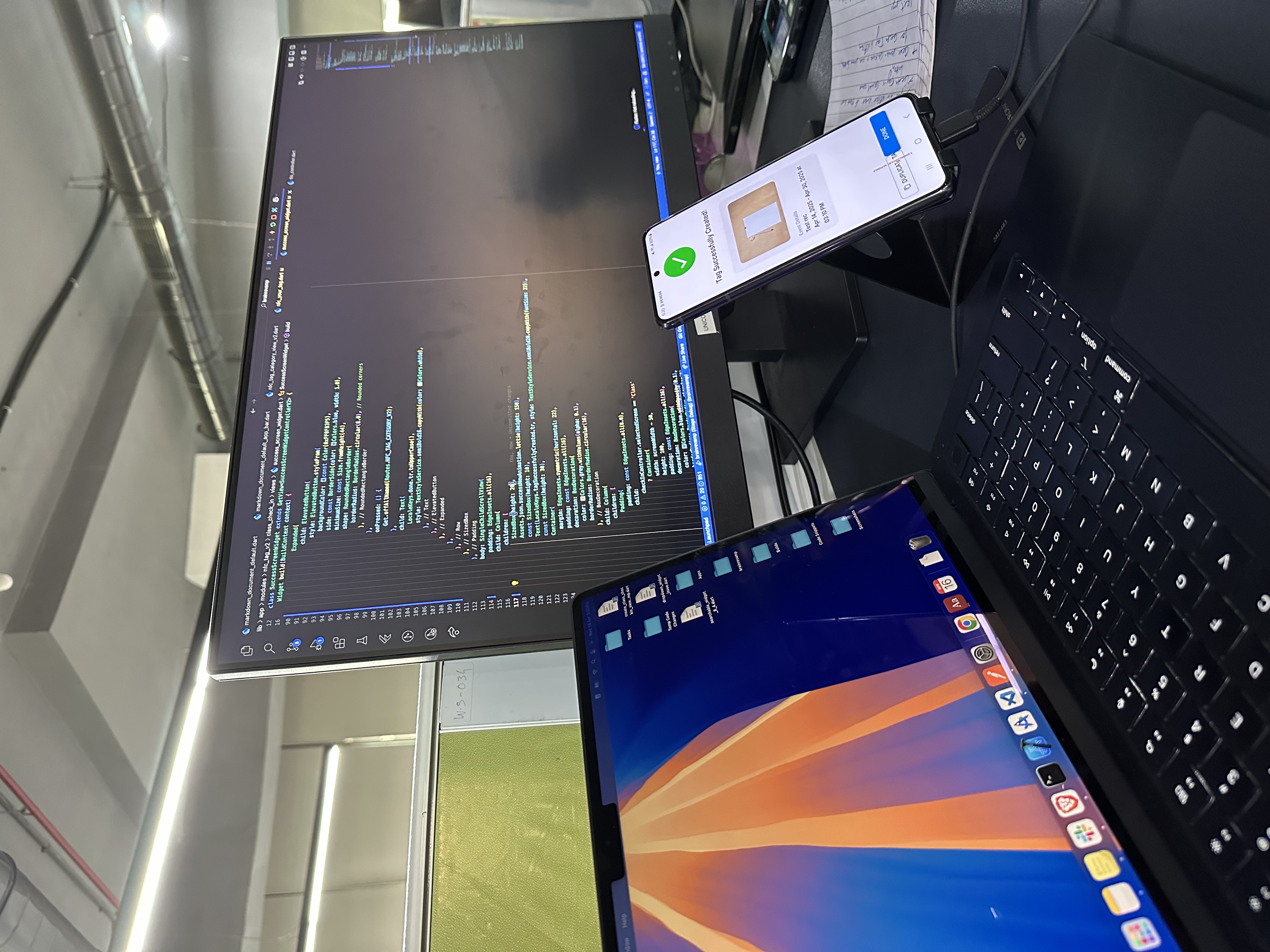
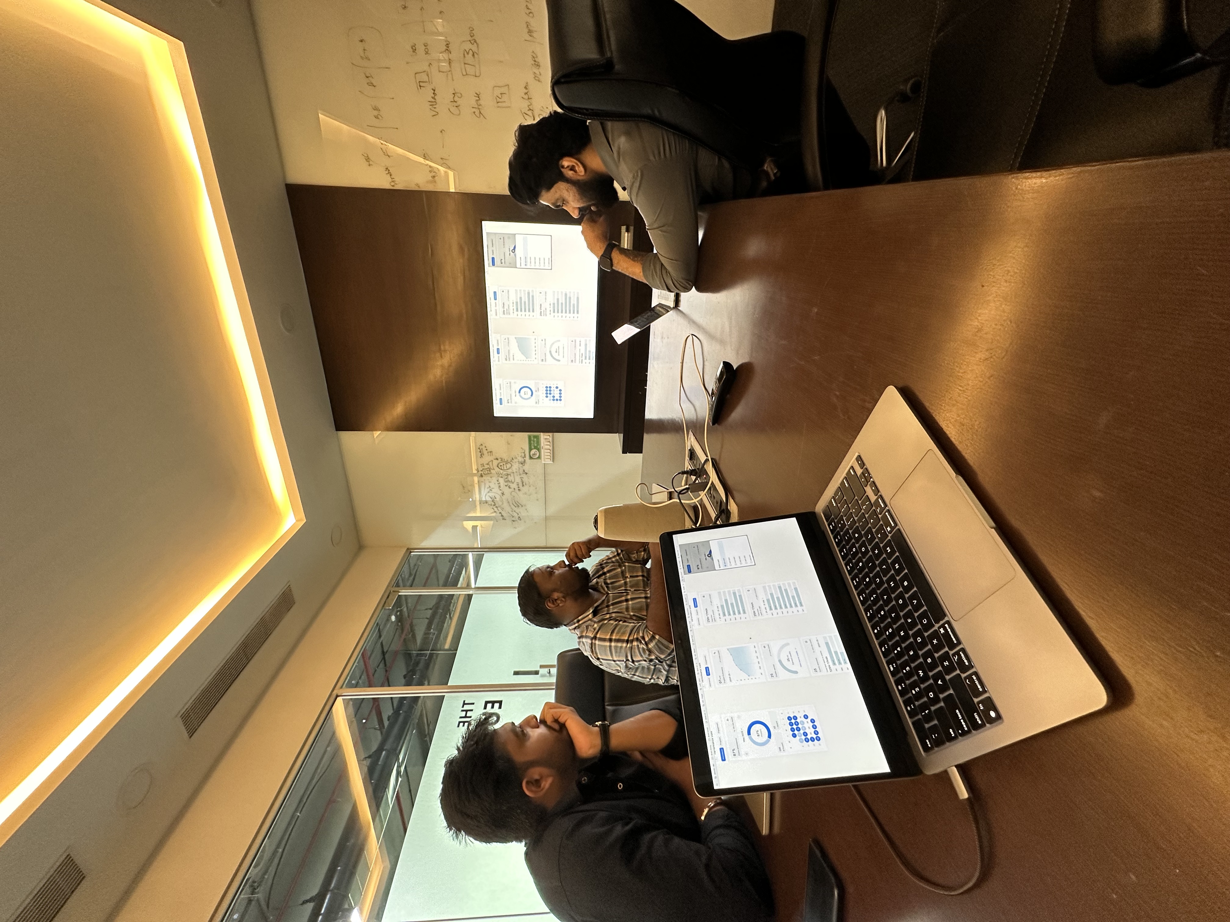
Bridge came together design-next-to-engineering — flows on the table, code on the wall, real devices in hand.

Most calls were made together, out loud: walking attendance and dashboard screens side by side, testing the NFC check-in on a real phone, and deciding — again and again — what to leave out.

Design and engineering reviewing Bridge flows together
FIG 7.1Flows on the table. Walking the app screens with the full team.
Building and testing the NFC check-in flow on a real device
FIG 7.2NFC, on a real phone. Testing “Tag created” against the live build.
Reviewing dashboard analytics on screen with campus scaling on the whiteboard
FIG 7.3Scaling to 76 campuses. Reviewing the dashboards on the big screen.
The attendance and progress performance-stats screens in progress
FIG 7.4Attendance & progress. The performance-stats screens, mid-build.
Version 1 · where we started

The app they already opened

The original had the pieces — classes, roster, rooms — but stacked them without rhythm or hierarchy. The redesign kept what learners knew and rebuilt around it, rather than making everyone relearn the app.

FIG 7.5 From the original v1 to today's One Feed.
Next — Bridge, behind the glass Bridge — Dashboards
Open for 2026

Have a product
to ship?

A redesign on the horizon, a 0→1 in your head, or just want to argue about button radii? My inbox is open.

akshatt4@gmail.com